Mexican food is easily a top three American staple cuisine. On campus, there haven’t been many great options to get the delicious mainstays of tacos, burritos, and more. That is until Vato Tacos came along. Over the years Vato Tacos has become the go-to on Florida State University and Tallahassee Community College campuses, but the brand didn’t have a look that lived up to the food. Additionally, the menus weren’t performing at their full potential.
Restaurant Branding
Vato Tacos’ initial brand identity was a mishmash of Mexican clichés laid out in cluttered compositions. The brand fell flat and felt cheap. Everything Vato Tacos was not. A complete rebrand was needed to usher in a better era for Cruz Hospitality’s brand with the most opportunity.
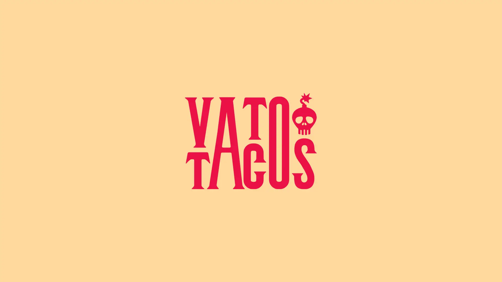
Refreshing the identity wouldn’t be enough, but that’s not to say everything designed to date had to go. The skull illustration served as a strong icon that could be rethought and redesigned to anchor the brand in something familiar for the student and staff patrons. But a basic skull wouldn’t be nearly enough.
“Explosive flavors” was a term used on some phone calls when describing the food at Vato Tacos. We took those words at face value and integrated it into the brand mark. The skull became an old school bomb with fuse. Now, THAT is explosive.
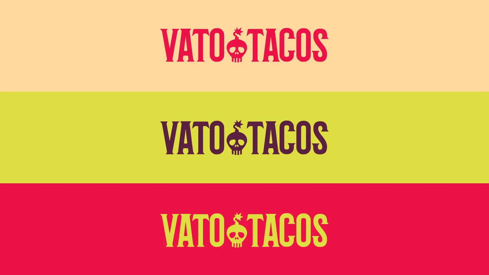
From that basis, a new typographic approach was introduced. Tall, bold lettering created a domineering, rebellious look. The slight serifs gave a hint at traditional Mexico, and the bold colors thrust the identity in the modern era. The condensed typography offset the various widths and weights of the brand’s type family, Roc Grotesk
Insight
A skull and vintage style cartoon bomb served as a visual metaphor for “flavor explosions” while creating a memorable brand mark.
Restaurant menu engineering & design
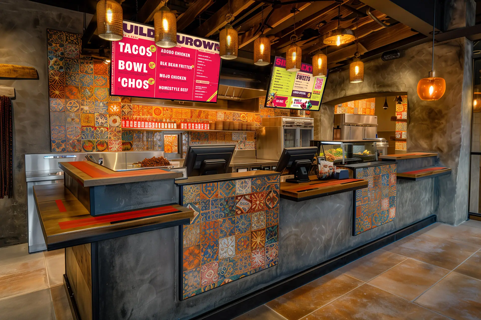
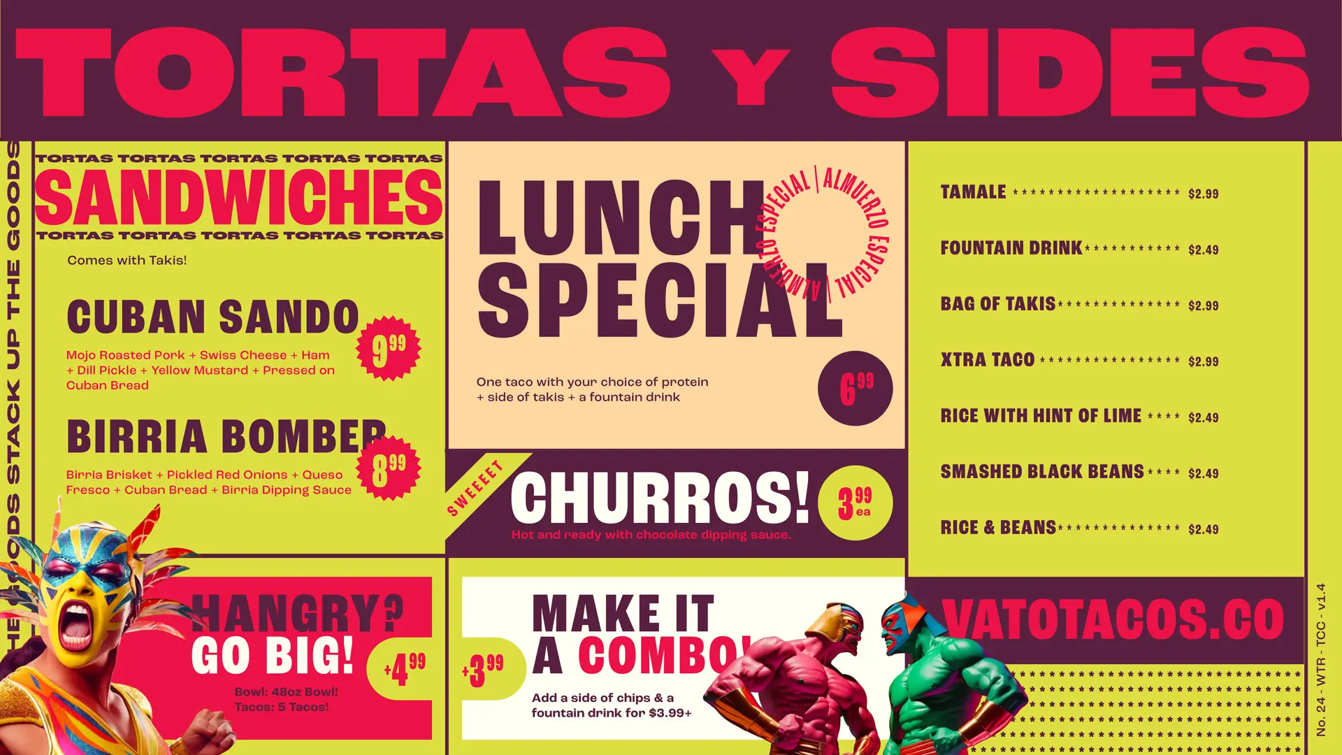
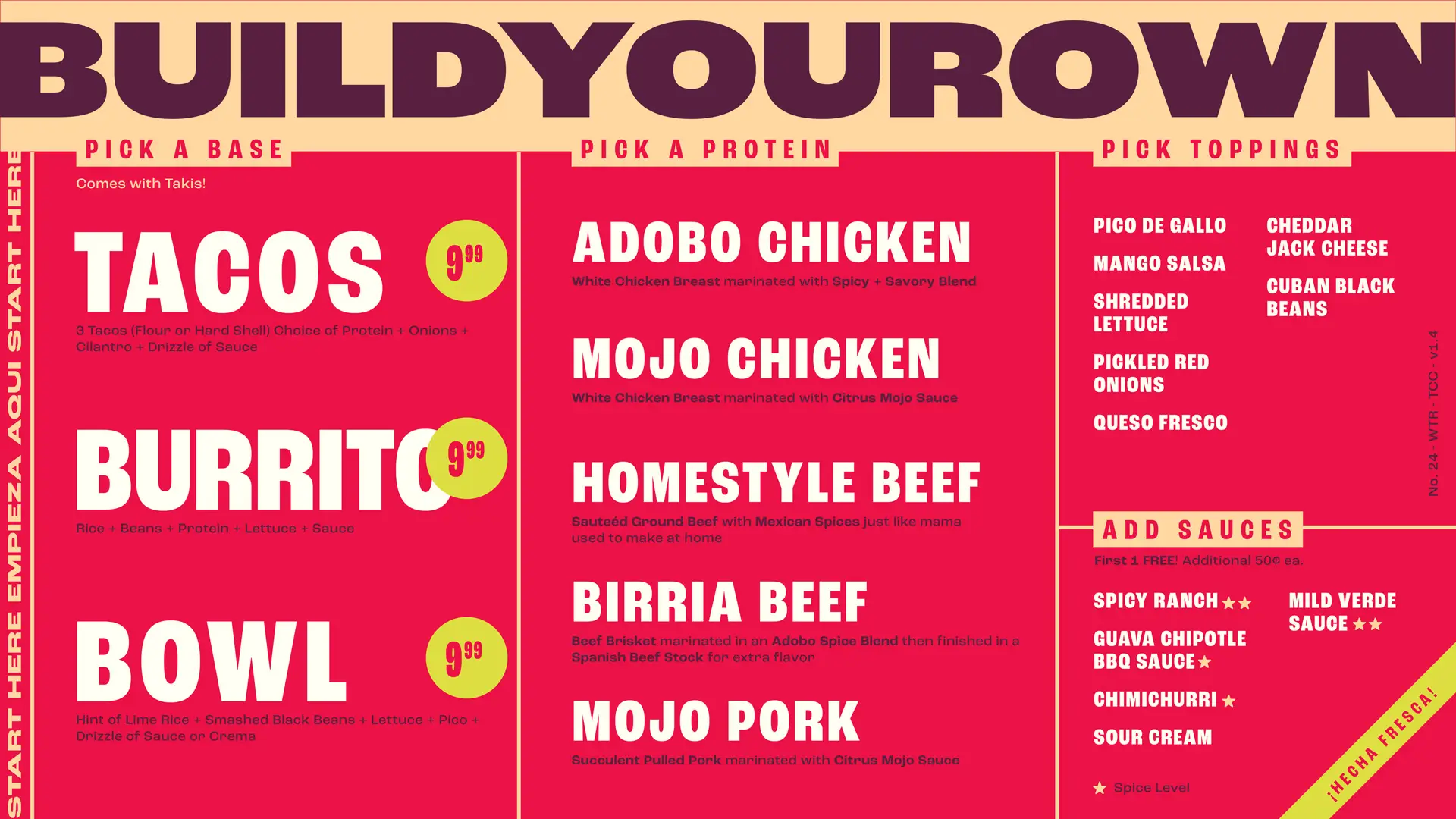
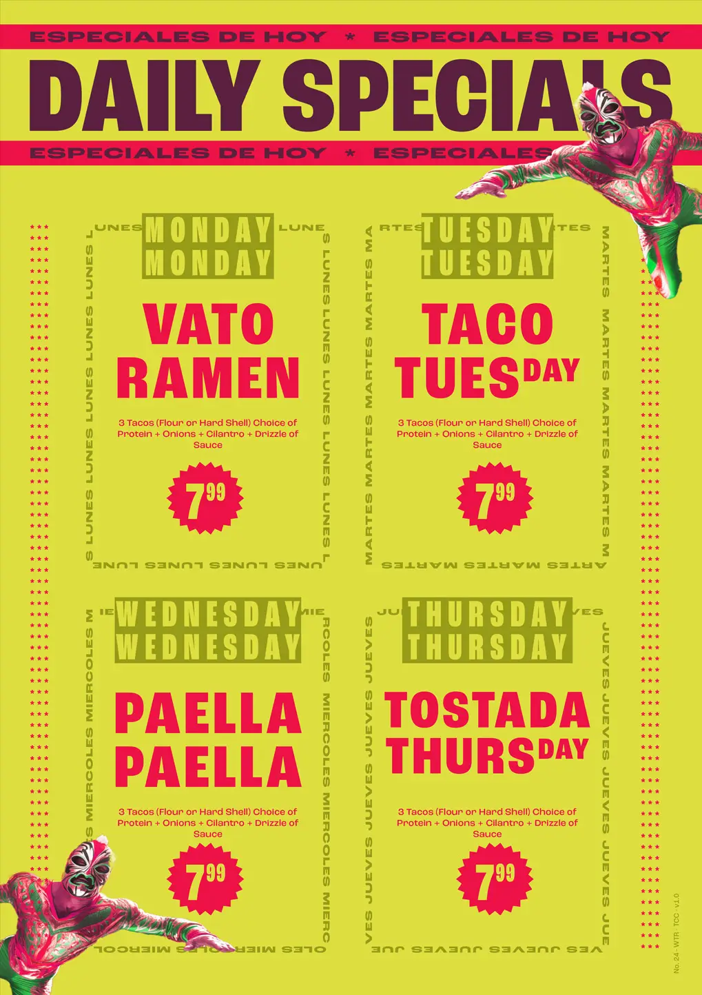
Vato Tacos brought in decent revenue, but the menu design was holding back from realizing maximum returns. No one, singular thing stood out as the biggest issue. Instead, it was the layout and approach overall. A full menu engineering workflow had to happen in order to optimize the experience and design.
By reviewing historic sales data and comparing associated menu layouts in the corresponding time periods, we were able to see some patterns. We identified items that were popular, profitable, and perceptual drivers and categorized them as such. We continued on to benchmark the pricing and found ways to realize more profitability where slippage was occurring.
Using the insights excavated from the data review, we wireframed new layouts for each of the two digital menu boards. Once the wireframes were finished, reviewed, and optimized for usability, we then applied a new design aesthetic that featured large, bold typography and clean user flows to organize the content. Additionally, we put emphasis on the most cumbersome part of the menu: the build your own section.
results
The new menus saw immediate uplift in sales, average order value, and revenue due to the restructured content and upgraded design.
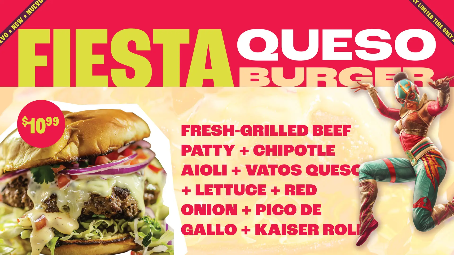
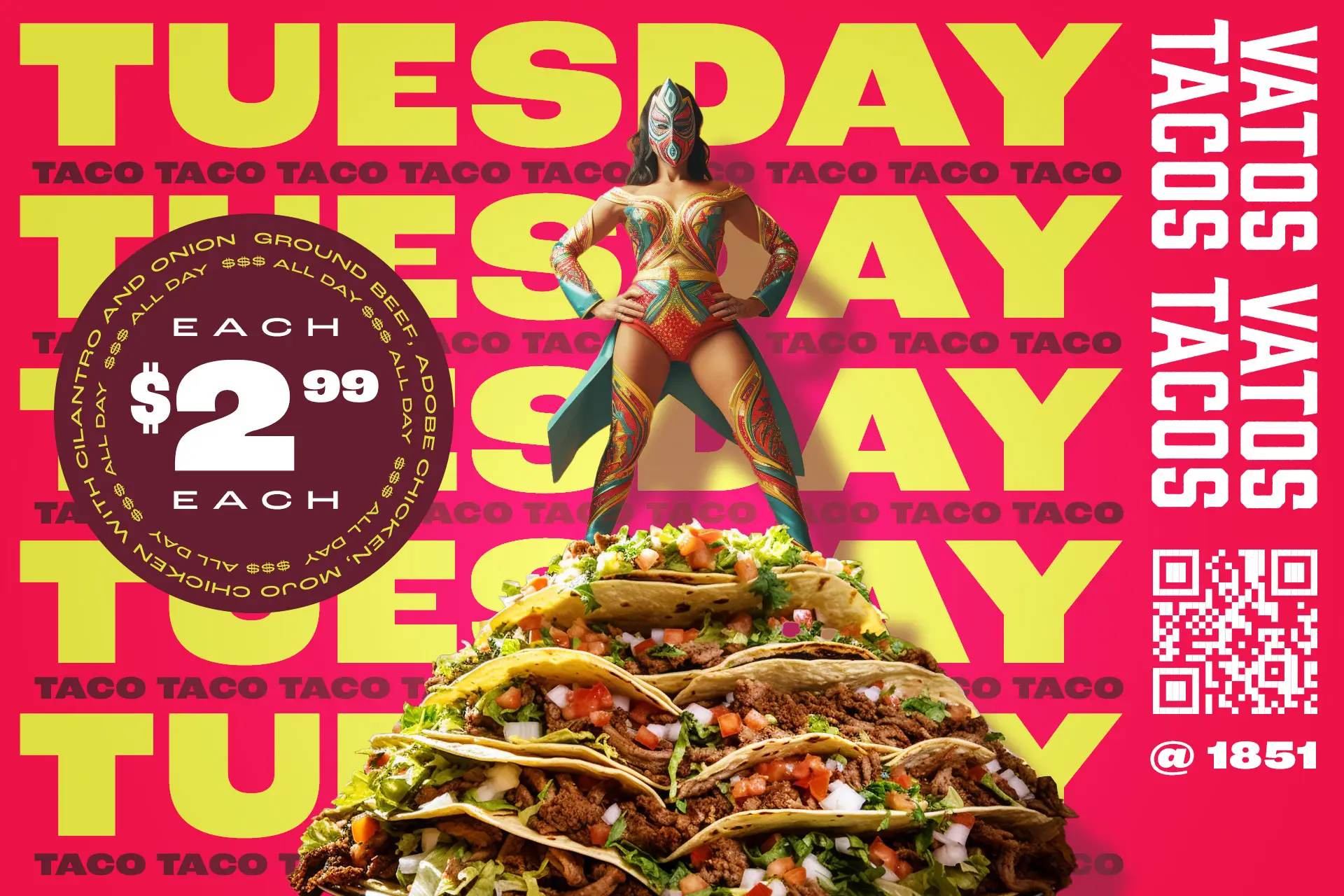
Restaurant Advertising Design
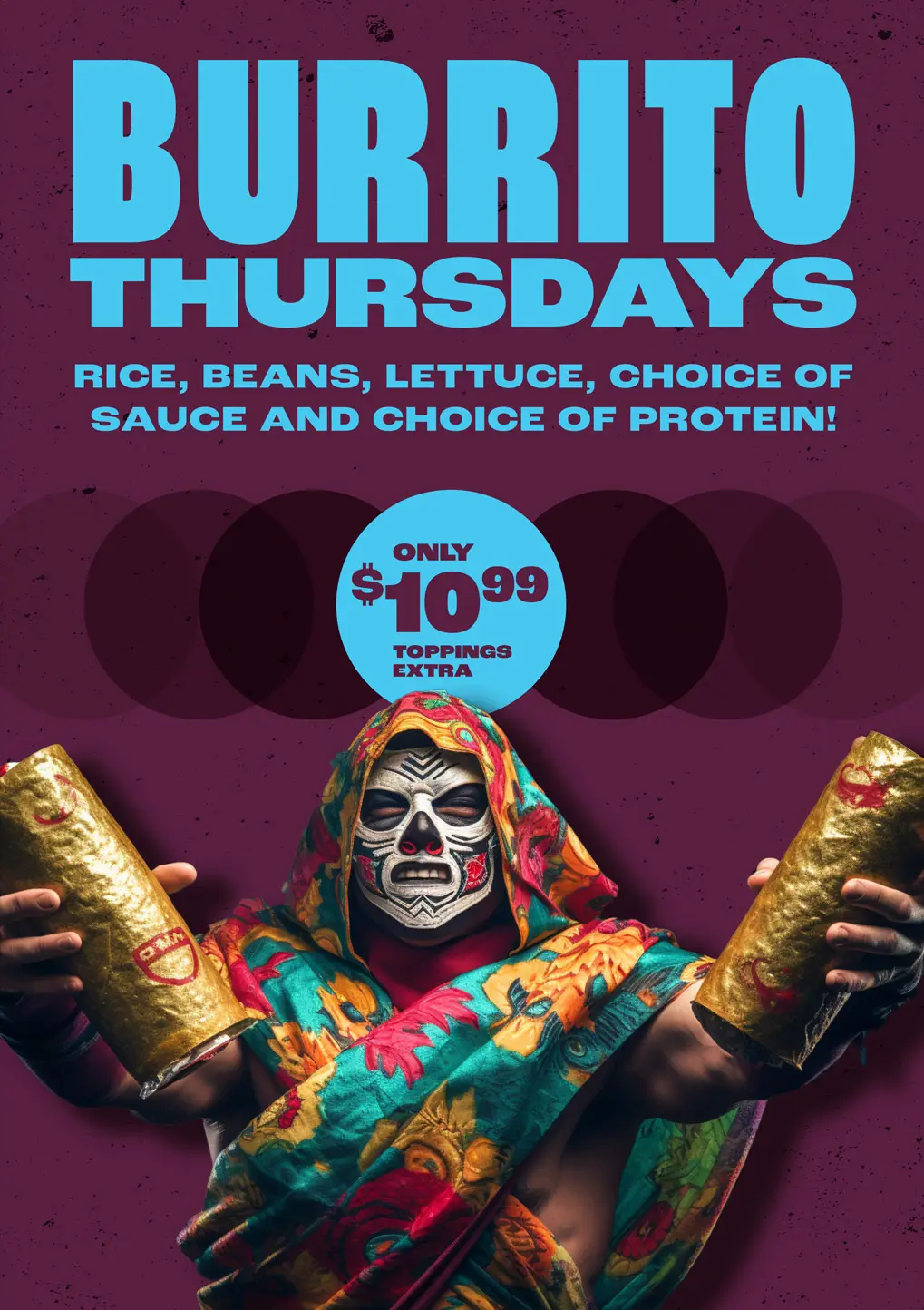
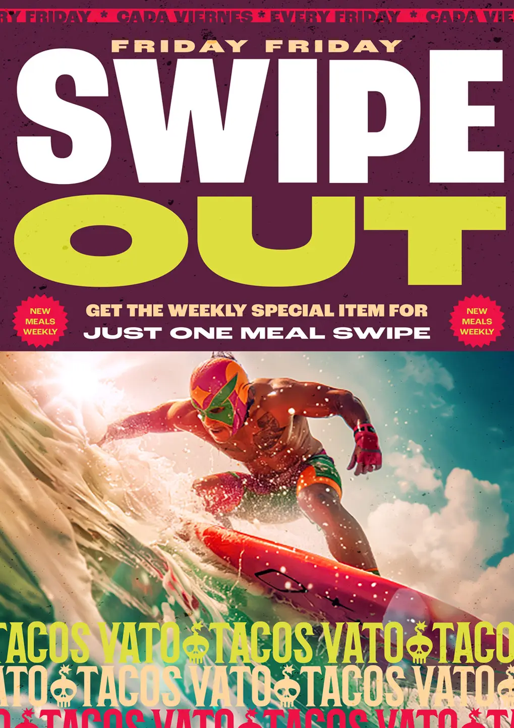
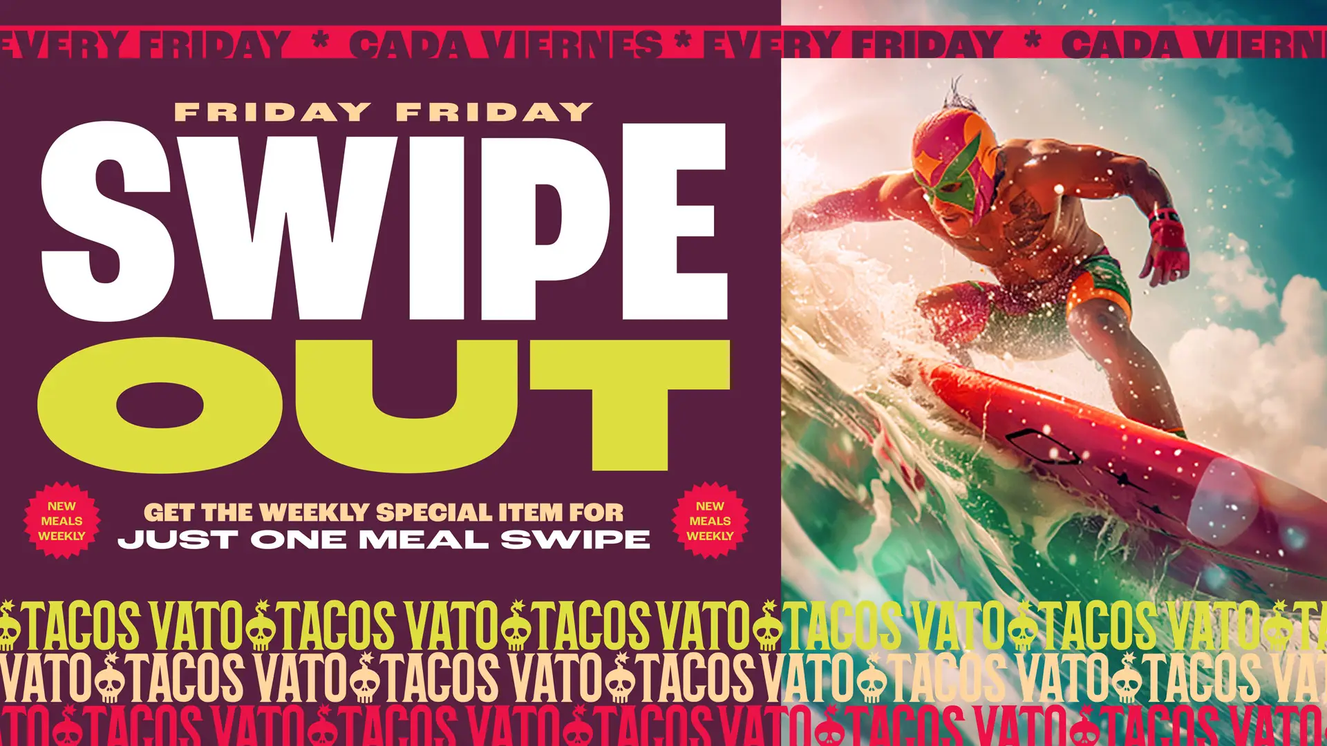
Keeping things interesting semester to semester while maintaining a steady anchor of high profitability and popularity was critical to realizing success. It was accomplished by launching seasonal special items which also gave the client a way to test out new flavors and offerings.
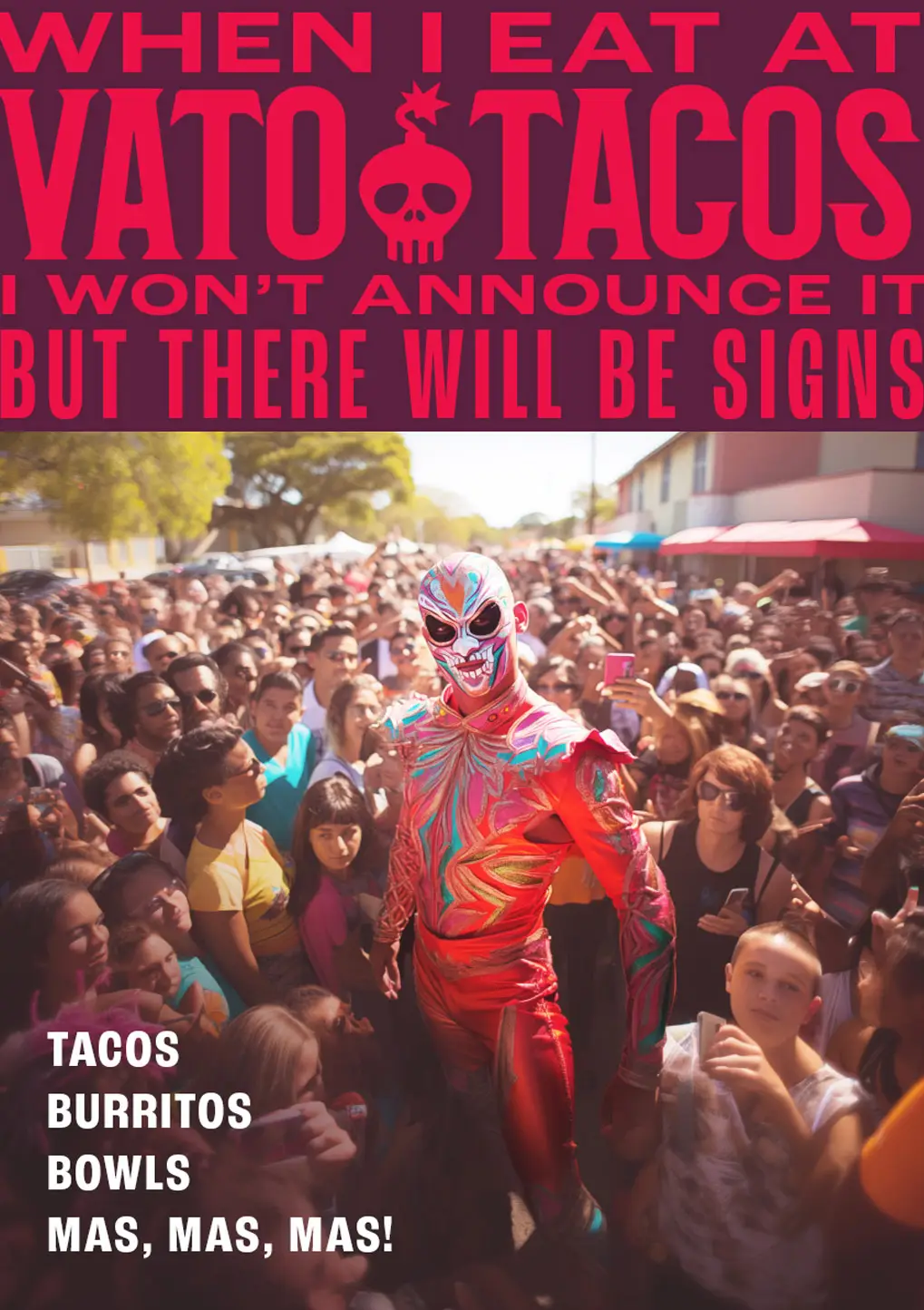
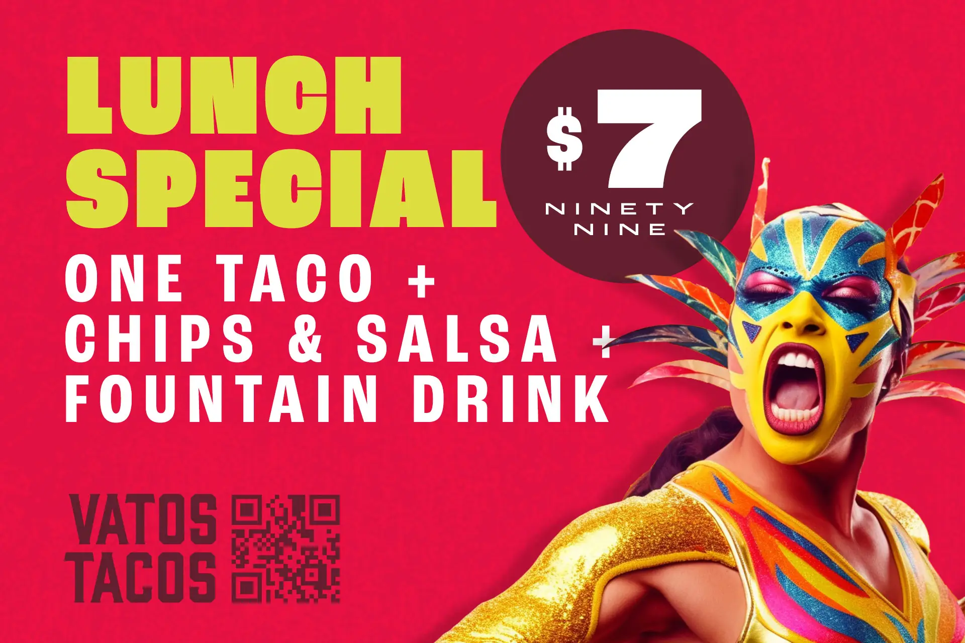
To promote these limited time offerings, we created digital and print advertisements. These ads grabbed attention with their bold colors and typography, and unique AI-generated luchador wrestlers nestled into the composition.
We took inspiration from vintage wrestling poster art found in the internet archives. These posters had bold, chunky typography and vibrant color combinations which were just the ticket to establish a unique identity for Vato Tacos.
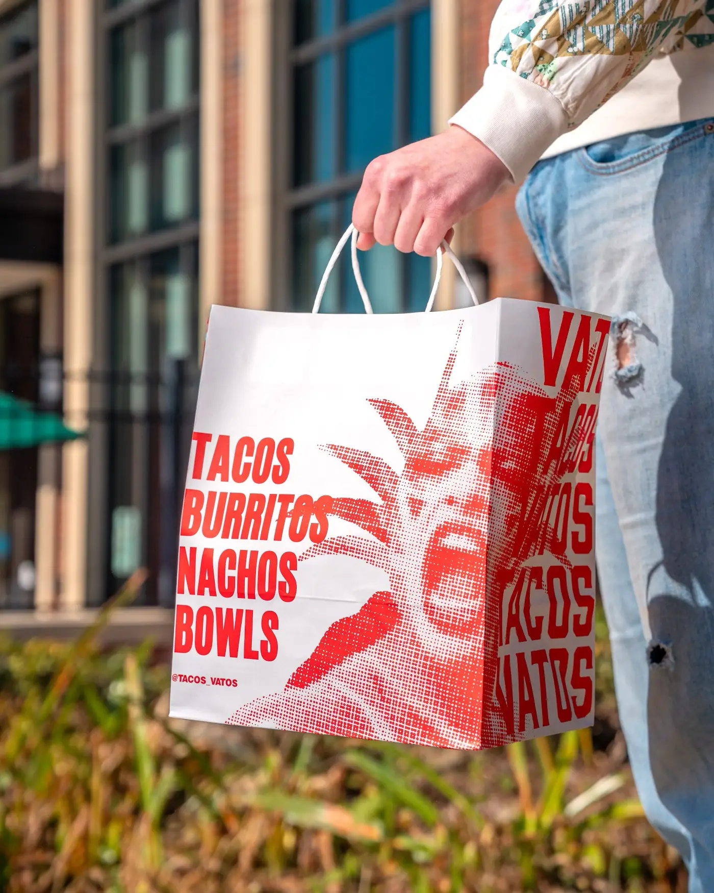
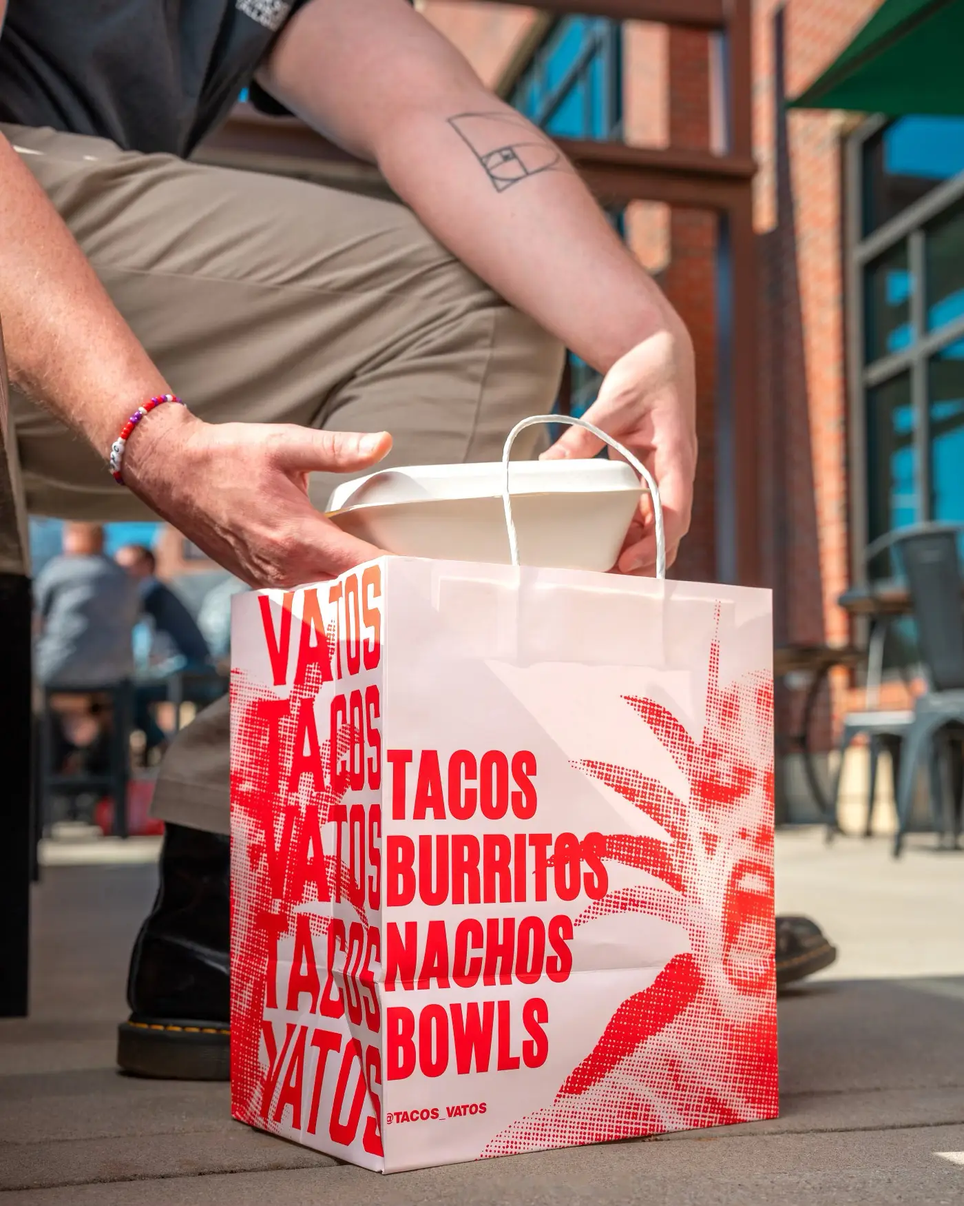
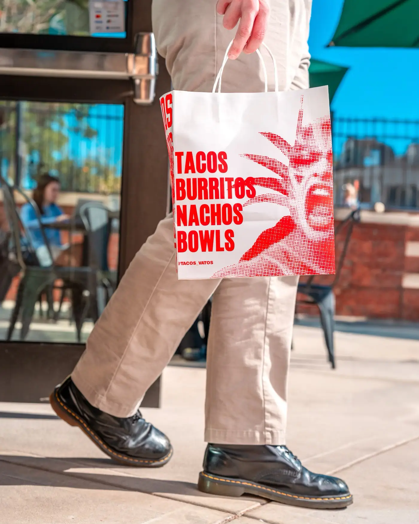
Another valuable touchpoint we took advantage of was the brand’s packaging. Specifically, the takeout bags. We applied our signature luchador artwork to the bag layout with bold typography and a single color to keep the cost of printing low.
Insight
Vintage luchador Mexican wrestling posters served as inspiration for Vato Taco’s promotional poster designs, menus, and other layouts.