Many areas of Italy claim responsibility for the creation of pizza. While the mainland tends to zero in on Naples as the epicenter of the pizza revolution, the nearby island of Sicily has held a claim to pizza but with a slightly different style. This is where we found the inspiration for a new pizza restaurant brand concept.

Restaurant Brand Insight
Searching for a strategic foundation for the new pizzeria was a journey through the rich history of Sicily. The concept vision was spearheaded by the desire of the company’s client, Florida State University, to have a pizza offering in the food hall.
Justo Cruz, founder of Cruz Hospitality, zeroed in on a fresh approach to pizza where rather than full pies, the students would have access to slices that were filling enough to sate their appetites.
After deep research into the history of pizza, Sicily’s deep dish style offered the right approach. While many dispute the ingredients used on Sicilian pizza, the one area of agreement was that it was a “white” pizza, meaning no tomatoes.
That fact makes a lot of sense considering the island’s lack of tomato growth and fuller focus on nautical trade produce.
Insight
Sicily’s “White” pizza was filling and craveable as a basis establishing the brand with authentic roots.
Restaurant Brand Naming
Pizza is well explored territory when it comes to names where traditional Italian names are served up with possessive formats. Names like Vinny’s, Sal’s, Paulie’s, and more all can be found on Main Street USA.
For this concept to make an impact, a fresh name had to be created. It had to evoke a sense of the past without seeming dusty and dated. It had to have some snap, just like the food itself.
Once again we tapped the origin story of Sicilian pizza for inspiration. This time it was more nuanced.
The “white” pizza was due to the sauce which was based on a standard roux base. Roux-based sauces are known as “mother sauces” since they serve as the starting point for many other sauce flavors.
It was from this basis that the name Mama Bianca came to be. But the name was more than just an ingredient. “Mama” conveyed a sense of caring and traditional cooking skills emotionally aligned with nostalgic warmth. “Bianca”, the Italian word for “White”, also had a motherly, feminine tone to it. Both culminated into a uniquely warm, and nurturing vibe.
Insight
Mama Bianca means “White Mother” in Italian which nods to the sauce on the classic Sicilian white pizza and the care put into the food.
Restaurant Brand identity
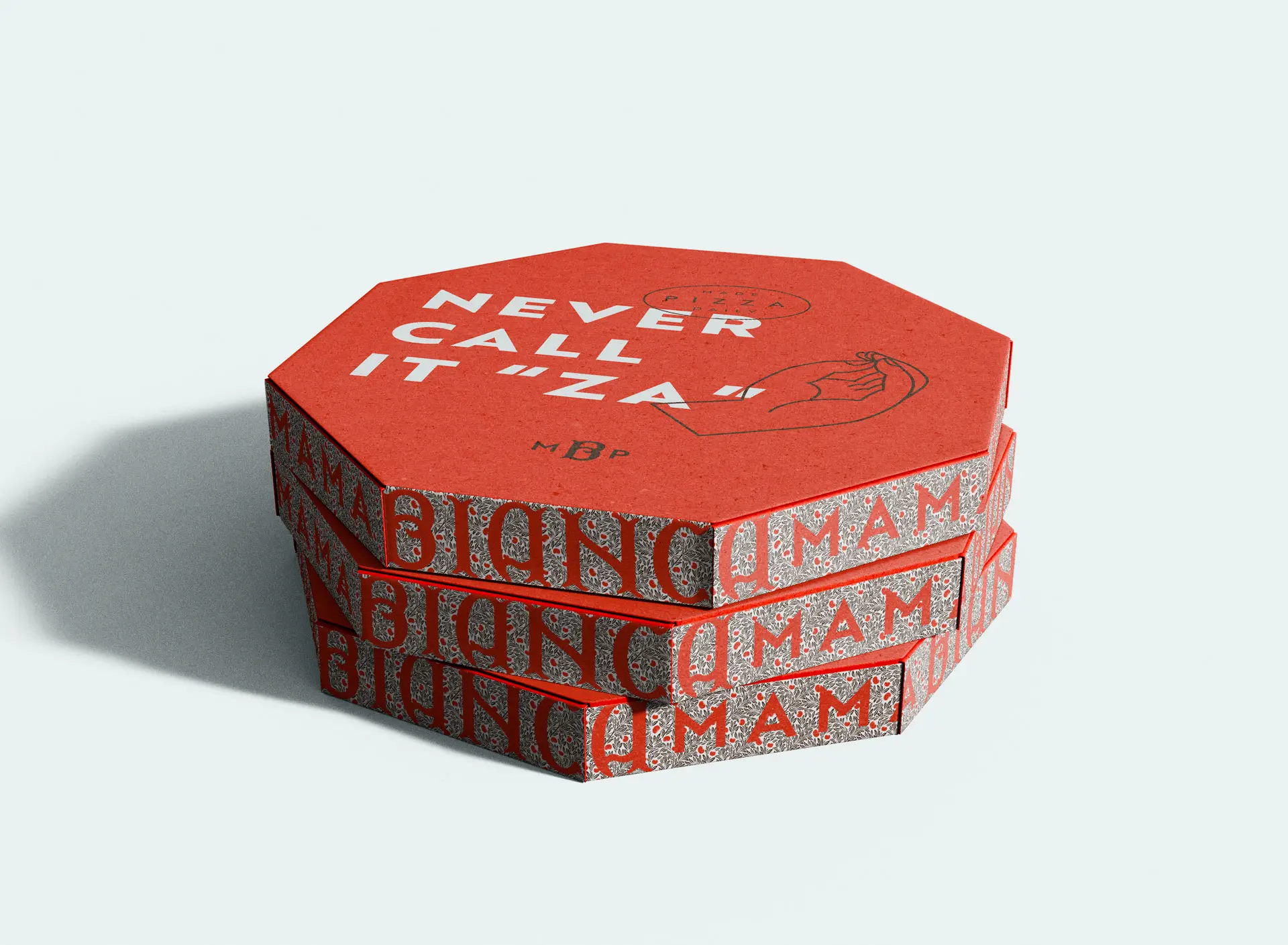
Brand identity design in the pizza category is also well trodden territory. All of the icons of Italy have been used aad nauseam making it difficult and frustrating to create a visual language that could be uniquely identifiable.
We continued our process of looking to the past to inform the present in our inspiration for Mama Bianca’s identity. In this case, it was finding an original photograph of a pizza shop in Palermo. One of the elements that stood out about this image was the typography design.
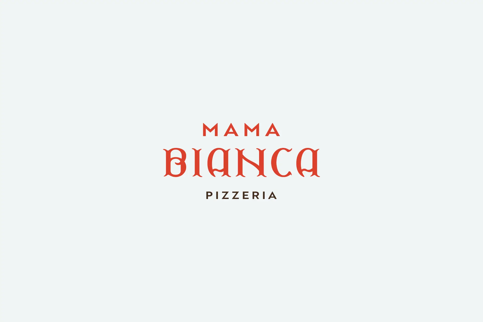
Taking inspiration from that original image, we created a fresh typographic approach to the word Bianca. It featured organic serifs and sturdy stems, the vertical parts of the letterforms, to create a bold basis for the brand’s look.
An Art Deco type accompaniment was used to set “Mama” and coupled with the custom typography to create a readable and unique typographic logo design.
The result is a fresh brand type treatment that bridged old and new while creating a relationship with other graphic elements in the visual language.
Insight
A vintage image of a Sicilian pizza shop in Palermo served as the inspiration for the custom designed typography for the word “Bianca.”
Restaurant Menu & Marketing
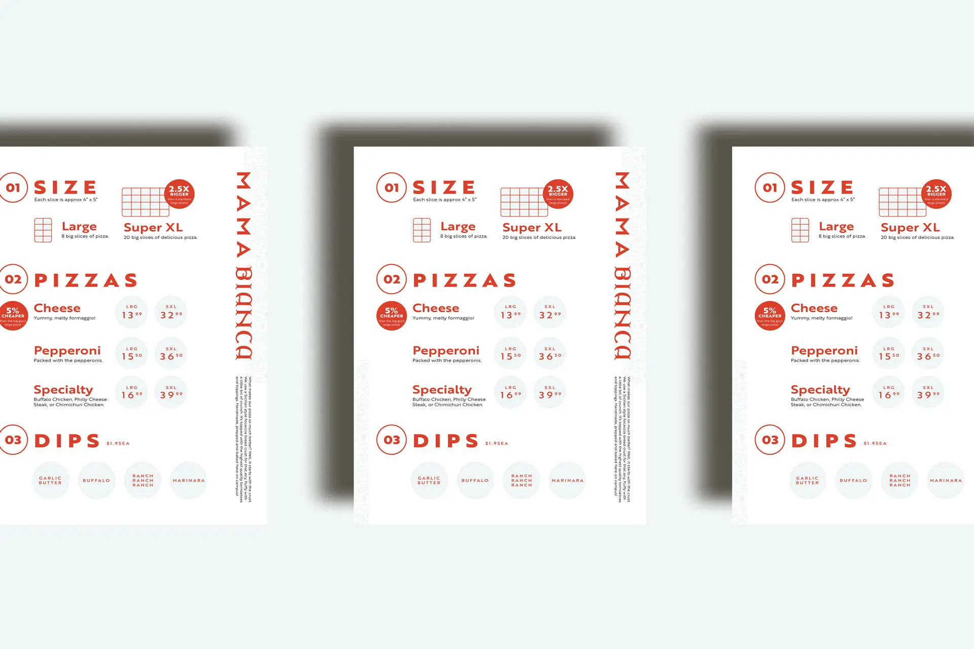
For Mama Bianca, we opted out of a digital menu board. The coldness of the tech took away from the more traditional, low tech feel of pizza shops found in Sicily and Italy. After all, this wasn’t a modern expression. Instead, we wanted it to feel more “shop-like” and therefore printed, handheld menus were the right solution.
The menus carried a simple layout that was easy to understand. It was optimized to shine a light on popular items while helping to increase the average order value with dips and drinks additions.
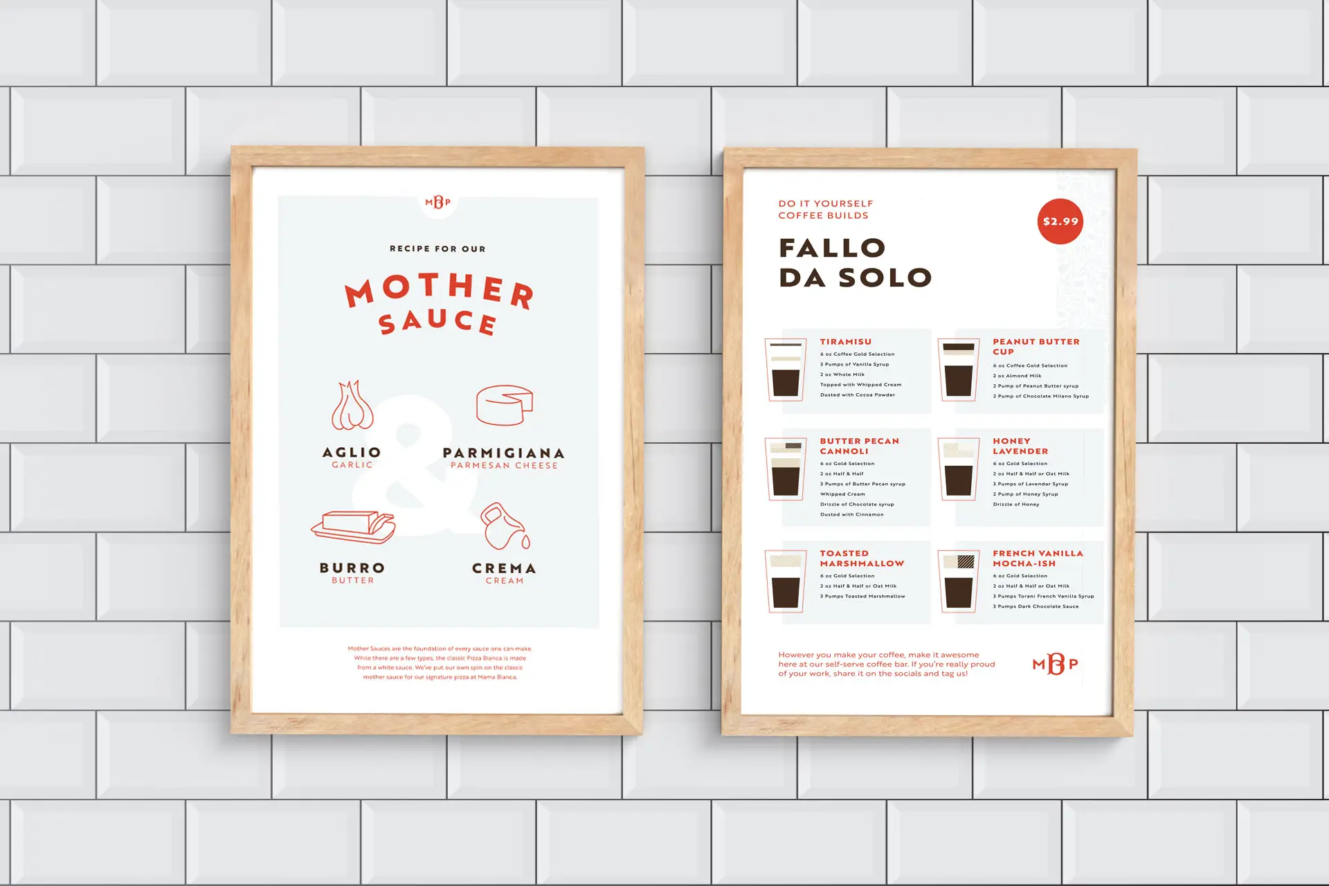
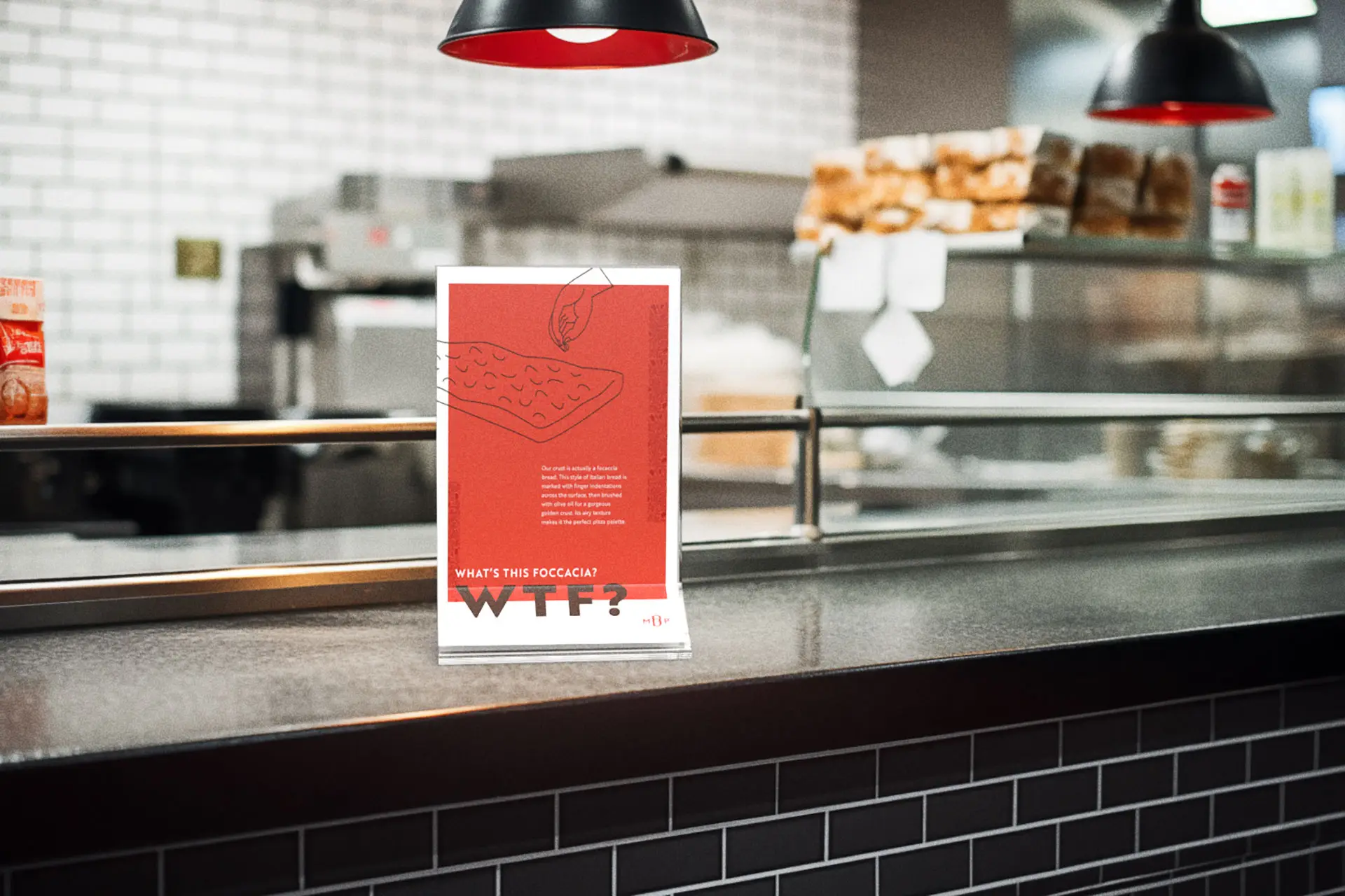
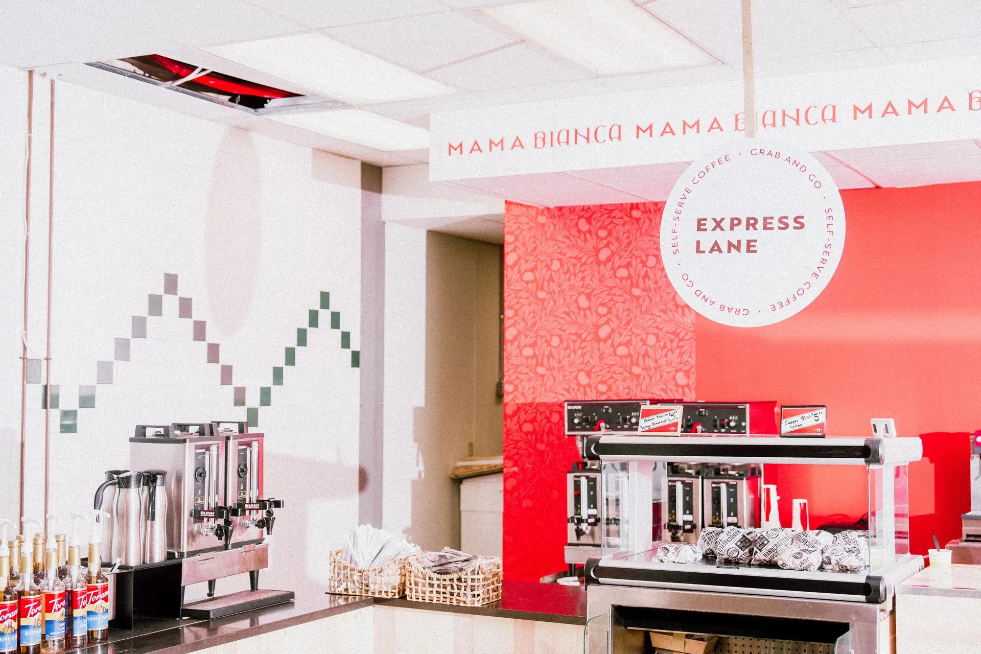
In support of the menu and experience, were marketing activations that helped instruct the guest and uplift the brand experience. A build your own coffee menu poster adorned the coffee station giving guests a starting point in creating their own coffee concoctions. Flanking that poster was a brand dive into how our pizza is different and why that matters.
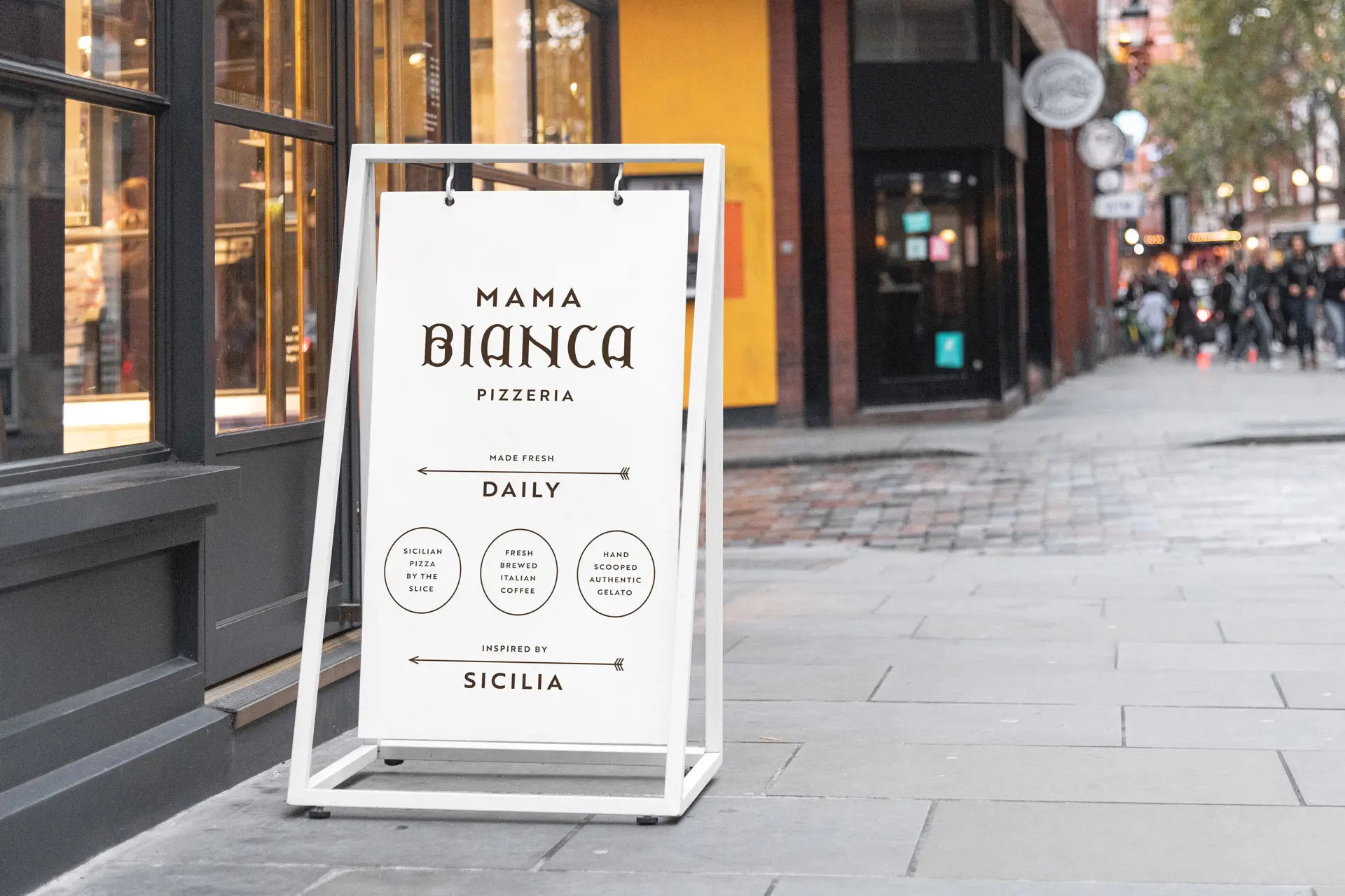
Elsewhere we activated marketing moments in the guest journey to subtly sell the brand. Sandwich boards drew people into the restaurant while point of sale elements helped introduce new items and options.
Insight
Mama Bianca’s brand identity and voice came to life across the marketing and menu touchpoints giving it a personality that aligned with the roots of the brand strategy.
Restaurant Interior Design
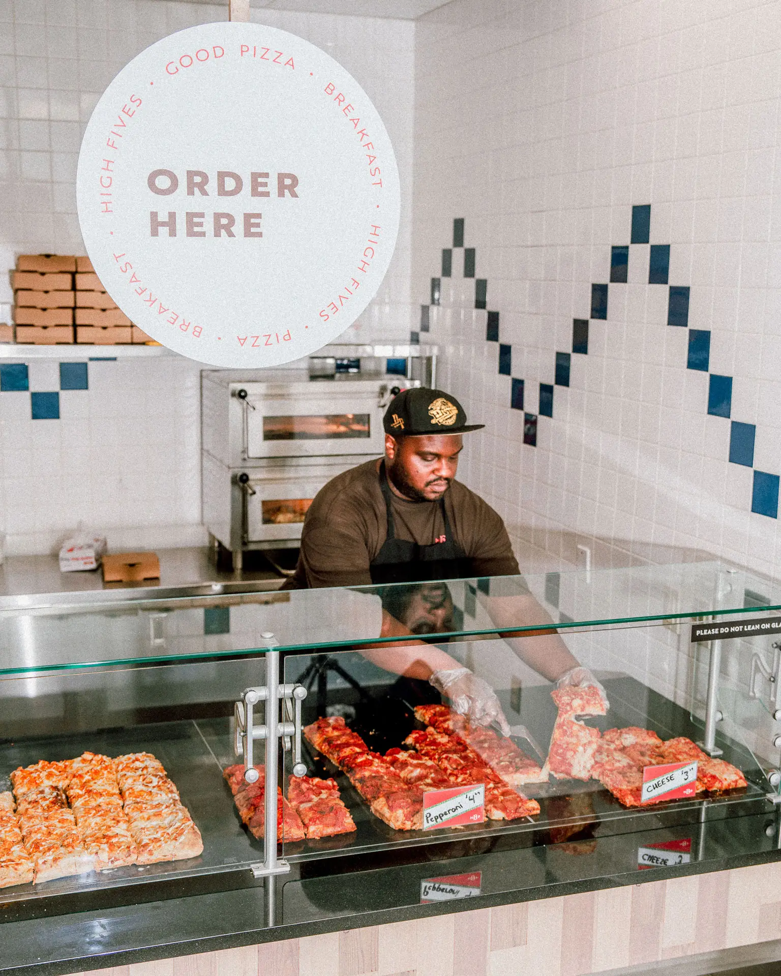
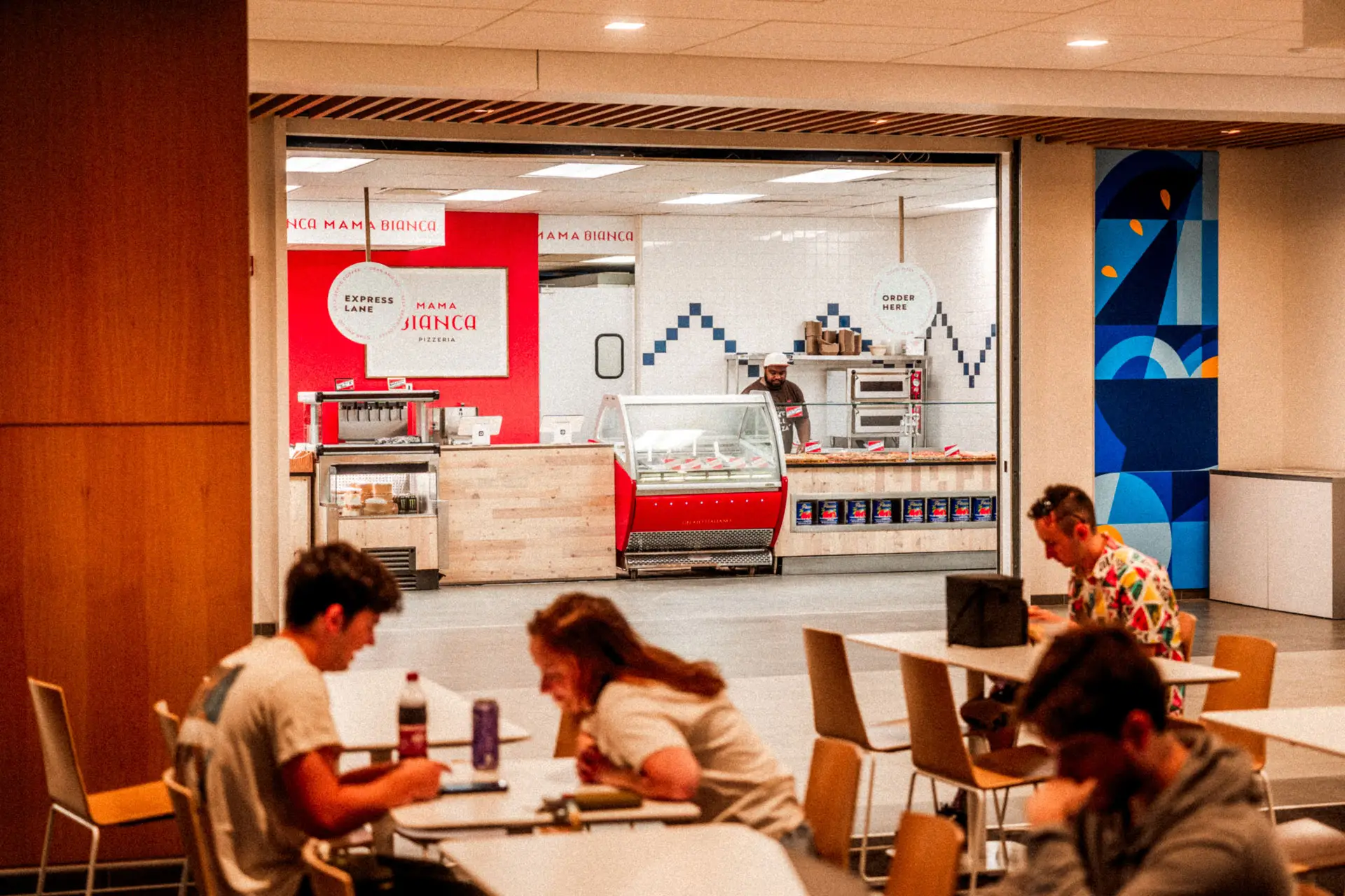
Mama Bianca’s interior design was a notable challenge. With only three walls to consider, and a well explored culinary vertical in pizza, we had to find a path that would be uniquely on brand but easily acceptable by the Patron base.
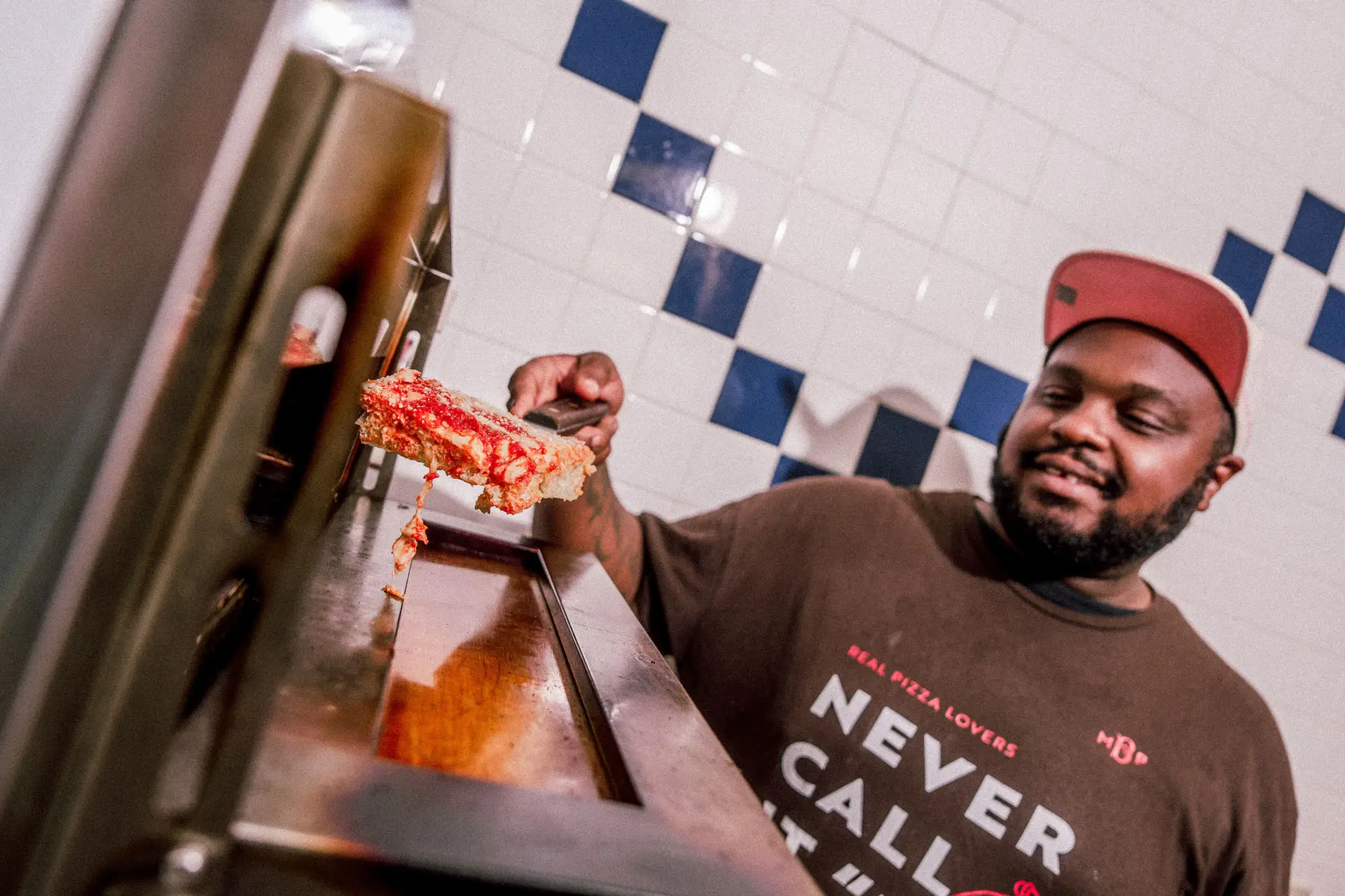
In researching Sicilian pizza shops, we found that path. A mix of simple post modernism supported by notes of art deco created a clean environment that shined brightly in the food court.
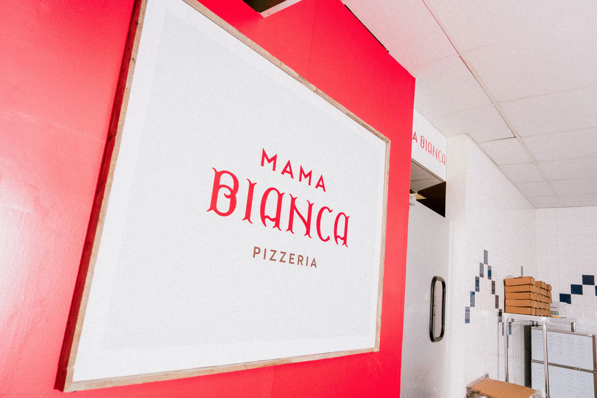
Natural wood textures gave a much needed organic feeling to the experience that was otherwise purposefully clean and semi-sterile. White tiles collided with richly vibrant red walls to grab the eye and trigger hunger.
The walls were activated with posters that told the brand story as well as supplemental menus that guided people along. These final touches pulled the brand experience together making it feel purposeful and concerted.
Insight
Having inherited the white tile work on the walls, we offset the sterile nature of the look with natural wood and vibrant reds to draw the eye in.