On the streets of Florida’s coastal cities, and much of the Caribbean nations, one can easily stumble across a stand selling fresh fruit. For a small amount of money the vendor will sell a coconut that’s rapidly hacked away with a machete to prepare for consumption. It was a dream of this experience that inspired the creation of a new fruit stand concept to be opened in a brand new food hall in Central Pennsylvania.
Restaurant Brand Naming & IDentity
We knew that the concept had to appeal to families. The goal was to introduce the beautiful sweetness of fresh fruit as an alternative to the commonly sugary treats given to children. Fruit had to take center stage as a result.
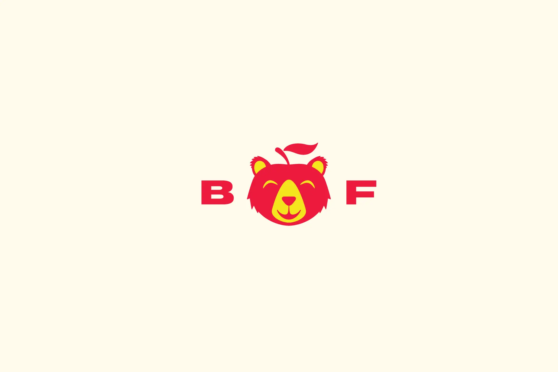
A common phrase served as inspiration and the basis for the brand’s name. “Bear fruit” meant to literally produce fruit, but offering a playful secondary meaning that visually played well with the brand’s goals. Not only did we want to bear fruit for our guests, we wanted to bear fruit for the ownership, too.
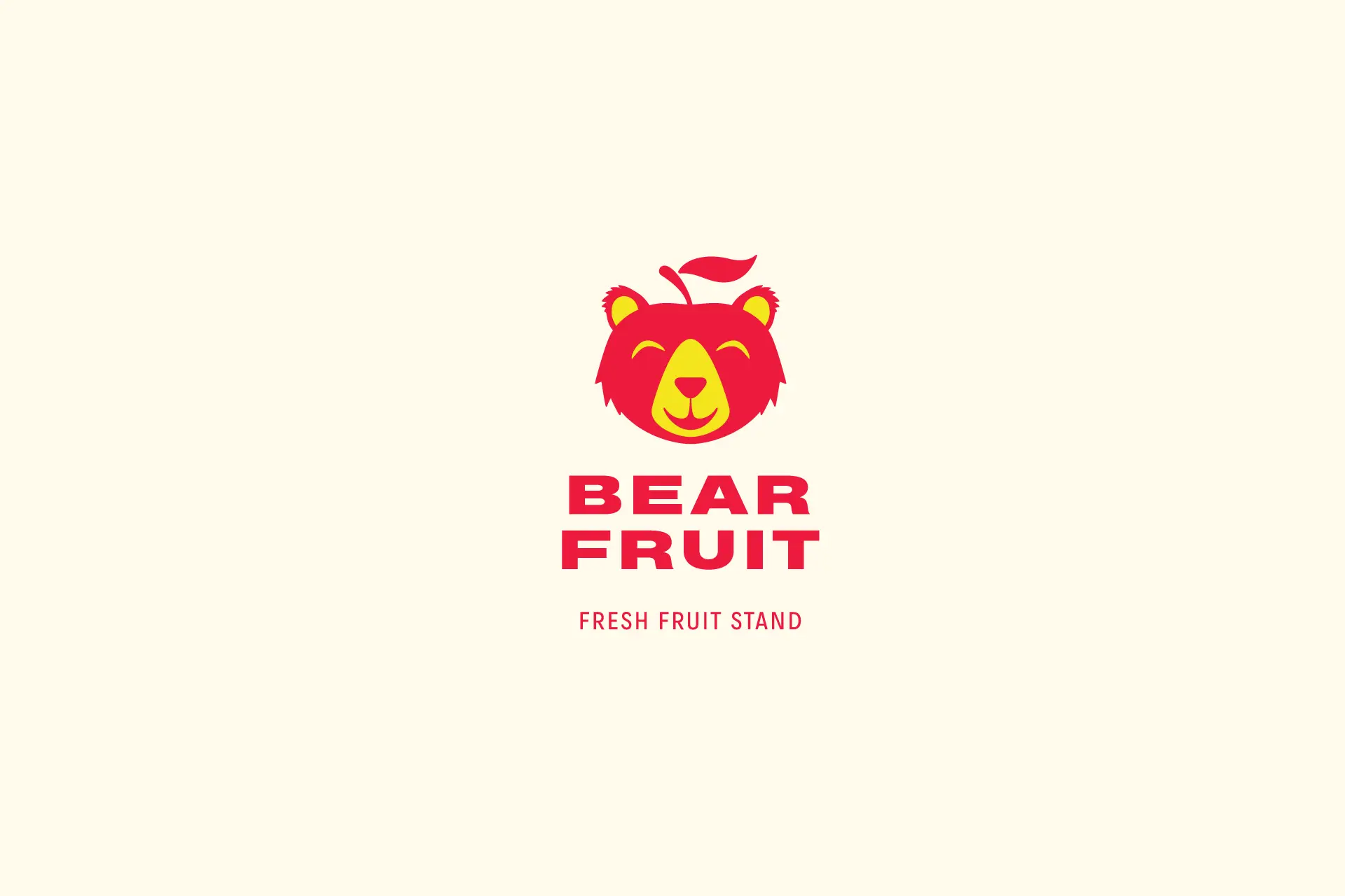
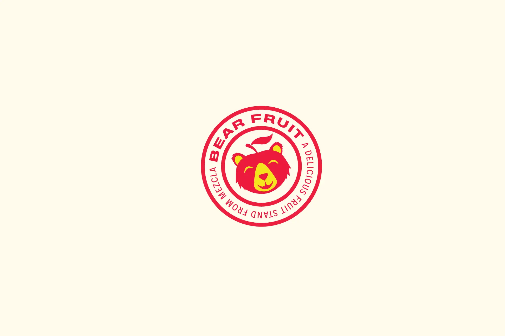
A bear and apple combined in a visual metaphor for the name that was playful and memorable. A literal bear and fruit mark established the brand as approachable and family-friendly. Supporting this mark was a strong, extended type treatment that created a supportive and balanced brand logo composition.
Fruit inspired colors comprised the brand’s color palette which conveyed a dedication to natural sweetness and vibrance.
Insight
A common phrase for realizing returns became the source of a name that meant “giving” and literally to give fruit.
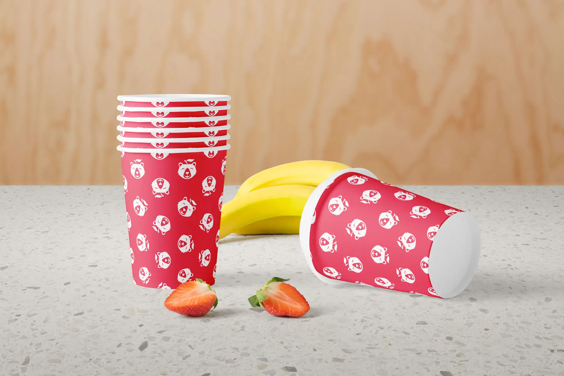
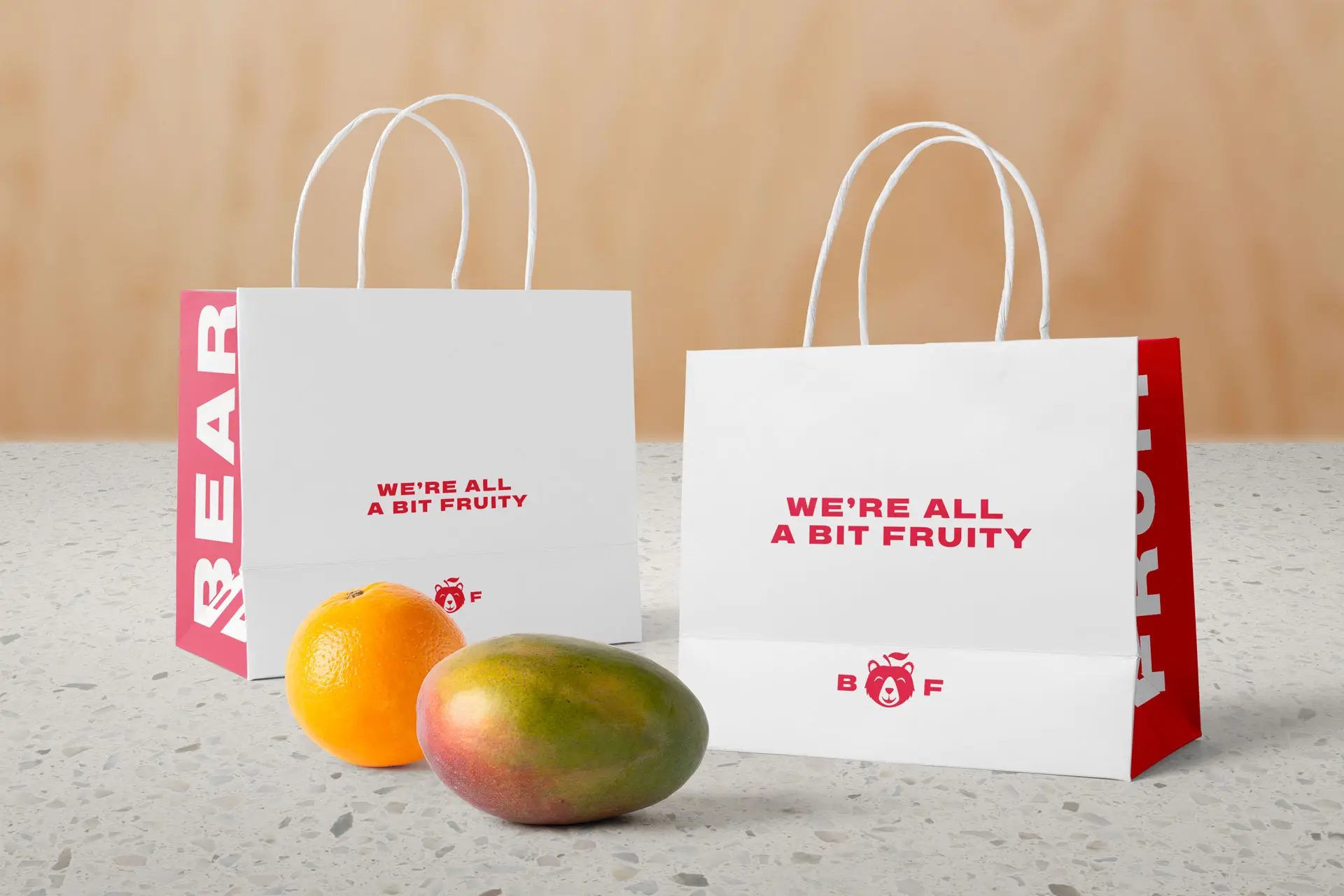
Restaurant Packaging Design
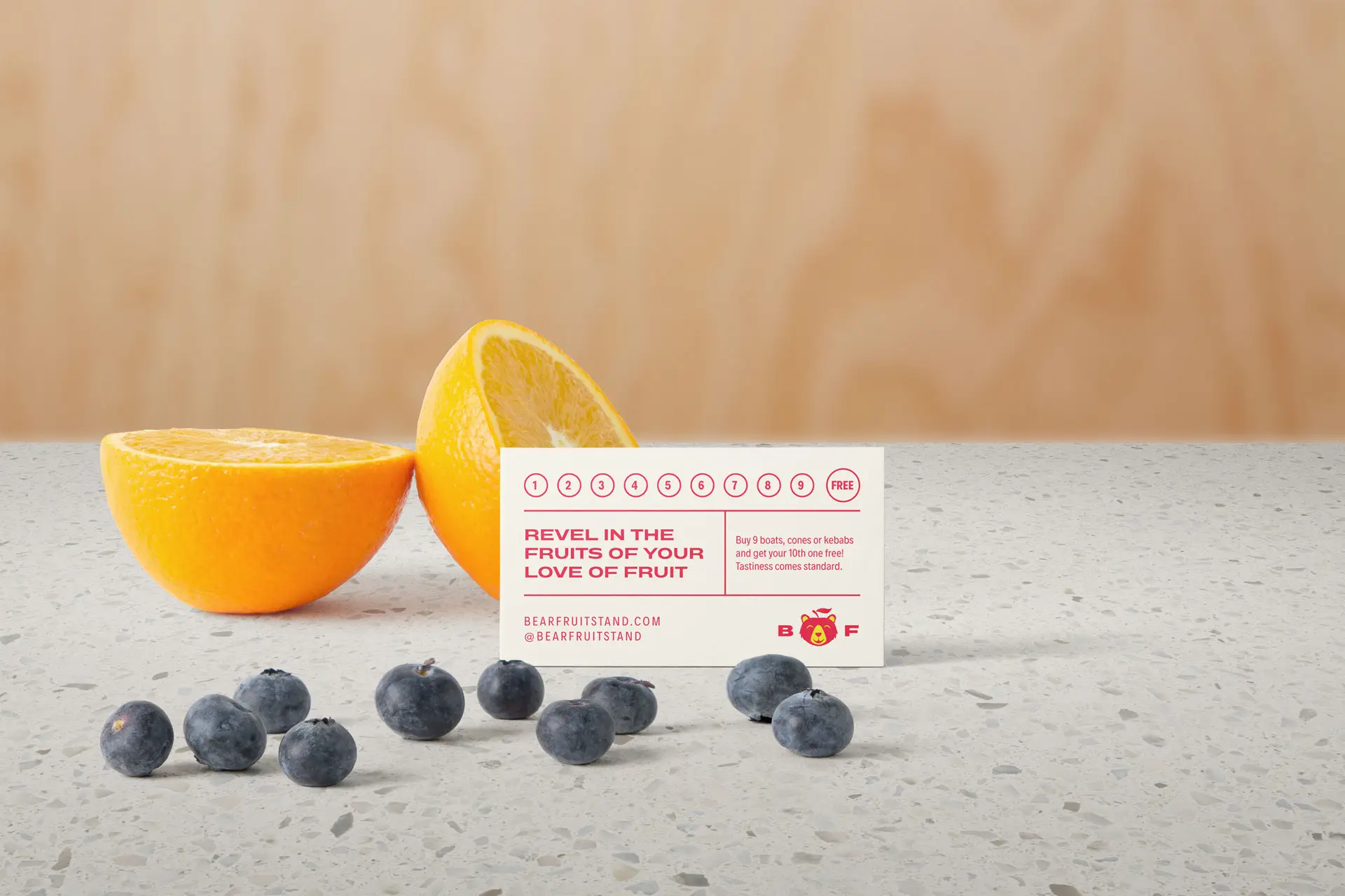
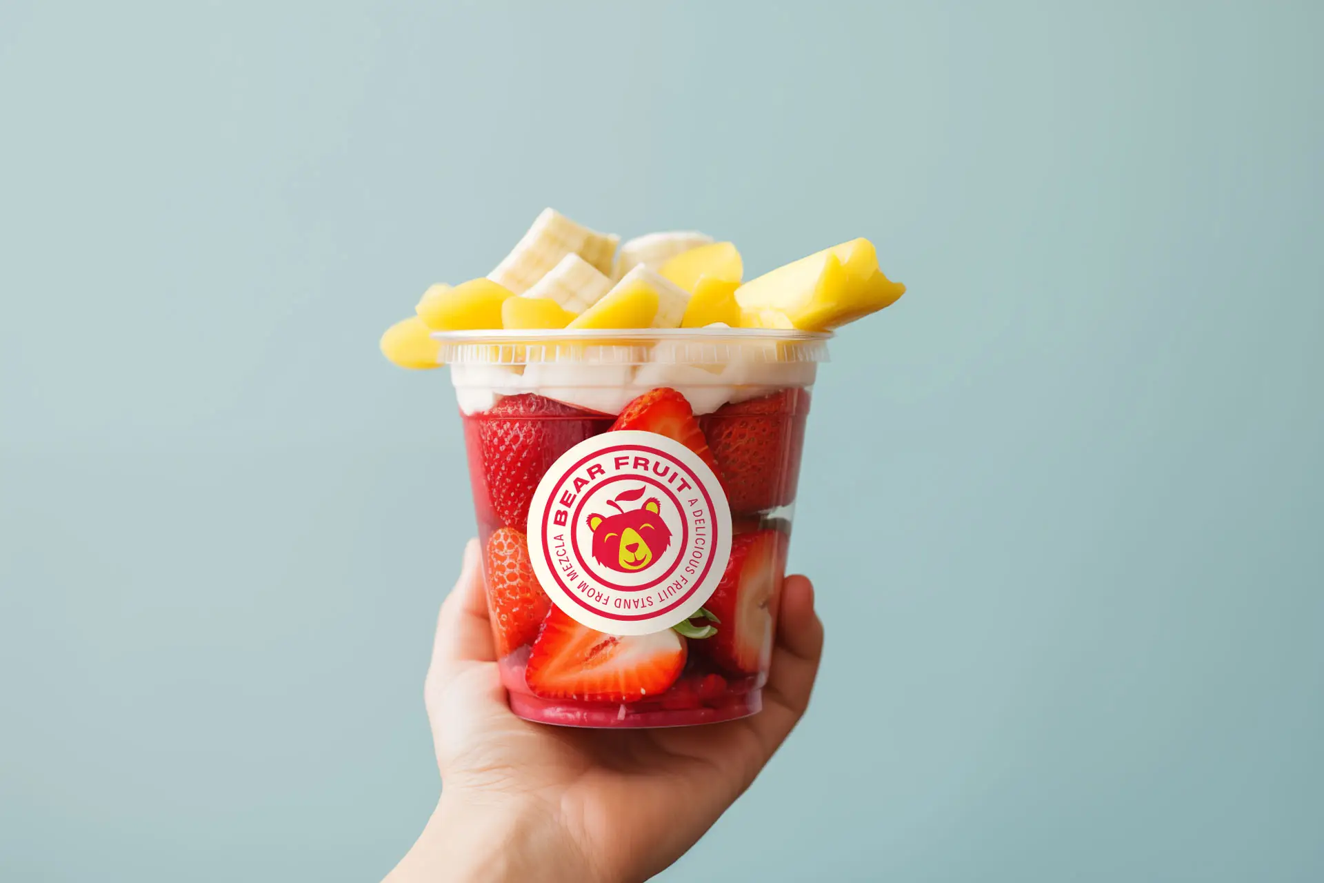
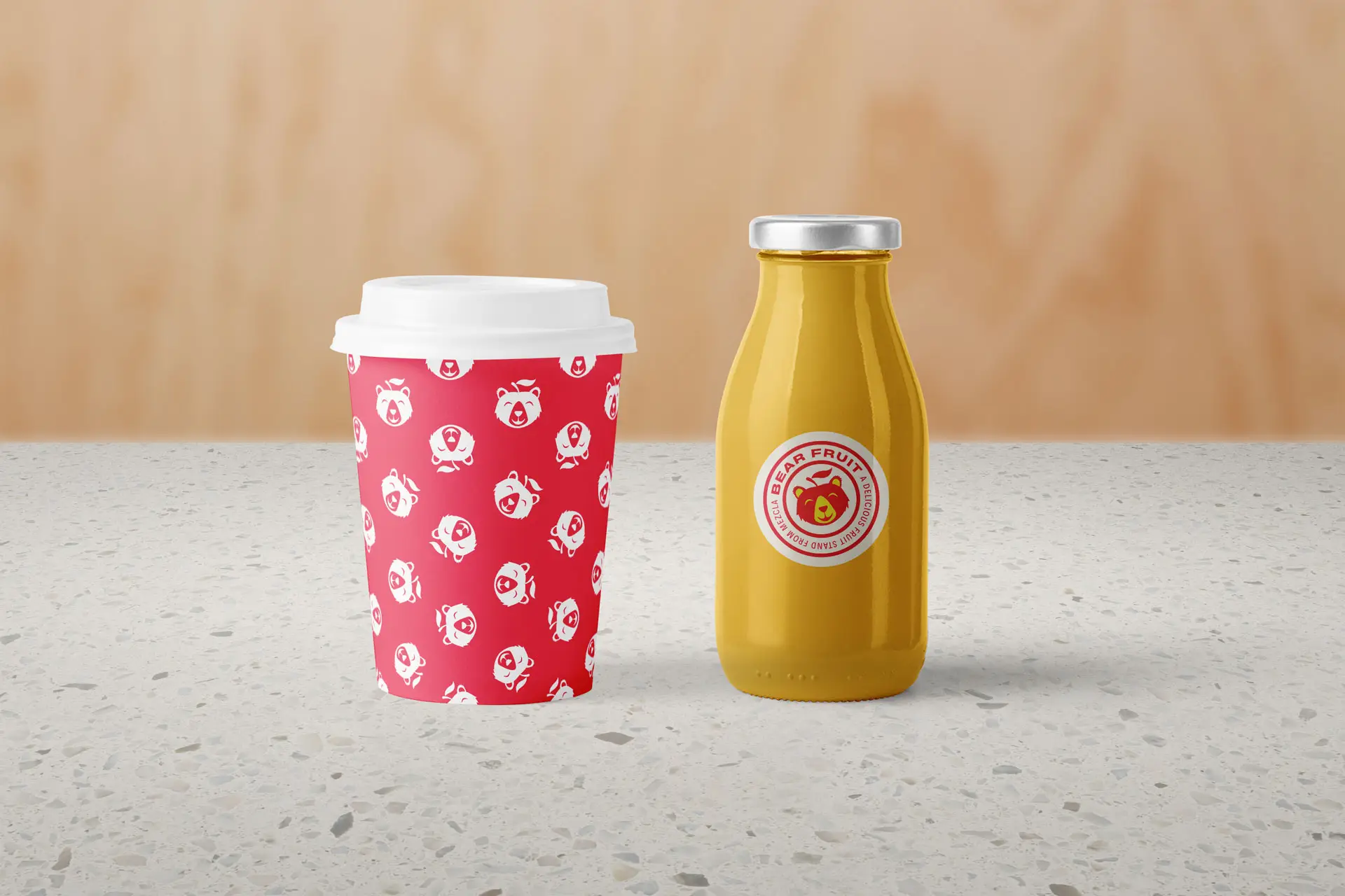
As a startup, packaging was a line item not easily afforded. We had to get creative with how we applied the brand to touchpoints that served both a utility and an opportunity. A mix of sticker labels and printed products created an affordable basis for the brand’s packaging suite.
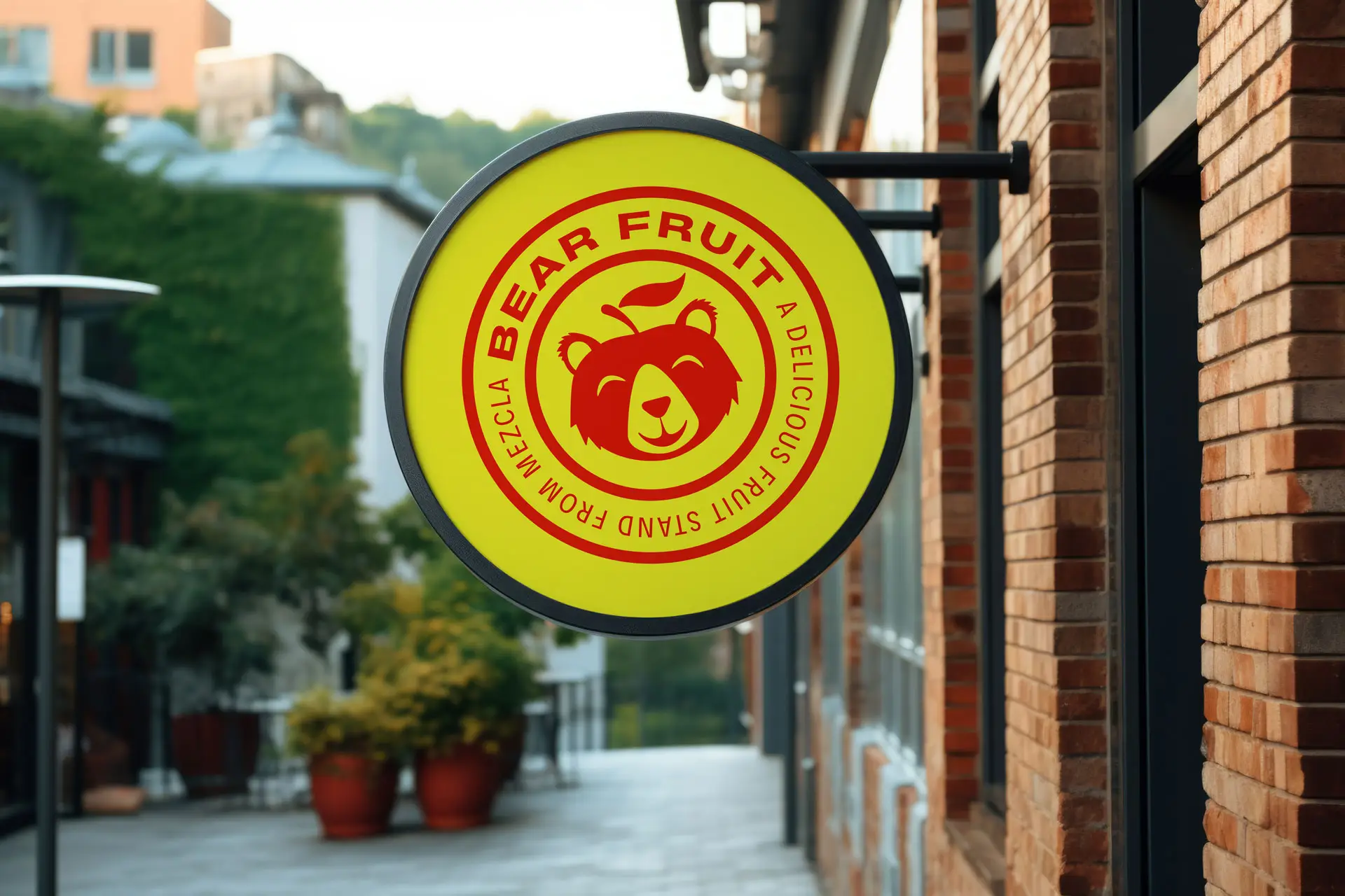
The printed elements offered the opportunity to continue the playful verbal identity established by the name, Bear Fruit and its corresponding logo design. Elsewhere, the simple seal lockup fit nicely onto circular labels that were versatile enough to apply to multiple surfaces.
Overall, the packaging suite was minimal and simple, but still profound enough to establish the brand and its identity.
Insight
Having a small budget for production, we had to be smart about what got printed and what received label applications.
Restaurant Interior Design
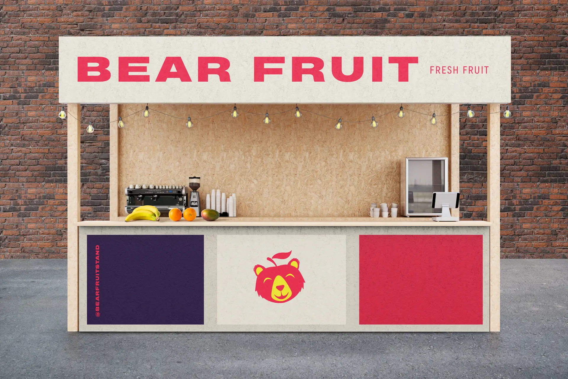
The food hall stall was a rather small one, but it still posed a big opportunity to establish Bear Fruit’s legitimacy. This was done by using simple materials like plywood which provided natural texture, and paint that allowed the grain to shine through. The stall was designed to feel like a street vendor found in Florida and the tropics.
Once again, the limited budget created the need for creativity in creating maximum impact for little investment. Ensuring the stall’s design was still strong without required lighted signage helped realize that goal.
Signage was minimal, but a circular sign was designed for the exterior of the building. The brand seal was applied to the circular composition fitting nicely into the shape.
Insight
Particle board and plywood offered natural textures which spoke to the natural aspects of the product itself while helping stay within a limited budget.
